
03 Aug 7 Clever Creations To Make You Reimagine Website Design
Website design and development is an ever-changing game that every business is getting on board with. A successful website can be the difference between a growing and a failing brand. Is your business looking to update its website design? Are you lacking inspiration or creativity to help spark some ideas? Well, if you are, then you need to check out this article.
Sometimes, websites can start to all look the same – a static page with too many words and uninteresting pictures. But when websites become interactive and break the bounds of typical design compositions, you can get pretty cool results. Take some time to check out these 7 clever websites we picked out to help show you the limitless possibilities of website creation, and to have a bit of fun and interaction!
A24 Films
(Source: A24 Films)
A24 is an American film production company that is dominating the cinema industry. Its films use a compelling and artistic production style that truly separates itself from others. Some of these include Midsommar (2019), Hereditary (2018), and Waves (2019).
Due to the production company’s originality and aesthetic, it’s no wonder their website also illustrates the same style. With an interchanging landing page, showing off some of their most recent films, the website uses large text and images, with seamless scrolling and browsing over their website pages.
Alan Menken
(Source: Alan Menken)
Alan Menken is a well-established music composer who is most known for his works on the Walt Disney Animation Studios movies. Some of these include Aladdin (1992) and The Hunchback of Notre Dame (1996).
His website illustrates an interactive portfolio of all his compositions across his historic movie collection. You can scroll through all of his 42 works, each with unique stories, behind the scenes and animations to accompany them.
Cellular Agriculture Society
(Source: CAS)
CAS is an innovative business for the process of farming real animal productions from cells, rather than entire animals themselves. Its website had to match its identity for such a future-thinking company.
You can effortlessly scroll through their business online, being met with beautiful 3D renders, seamless transitions, animations and bold colours. Their website demonstrates the simple ways websites can be transformed by taking techniques like transitions and sliders to the next level.
Species in Pieces
(Source: Species in Pieces)
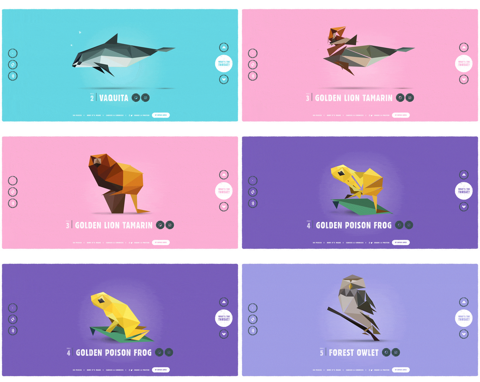
Species in Pieces is an interactive, colourful website that uses CSS to illustrate animals who are endangered. Each animal is accurately depicted through the use of triangles, which transitions to new coordinates for the next animal using code.
The low-poly style of this website shows how simple design can be eye-catching and engaging for audiences. It also makes reading about more difficult topics, like endangered animals, far more enjoyable and exciting than just text blocks on a webpage.
Poppa
(Source: Poppa)
Poppa is a website dedicated to the promotion of a Brazilian music duo based in London. It uses a bold colour palette to help grab the audience’s attention and highlight important information.
It only uses some simple interaction when you move the mouse across the text in the middle. Although it has relatively little going on, it demonstrates how using less can sometimes be more
Kustom Thrills
(Source: Kustom Thrills)
Kustom Thrills is an American website for a tattoo parlour. This article needed to show at least one website that is just simply small-business related. The website shows how to nicely display your business, using techniques to bring it alive.
The website takes you down their business story, showing the owners and the team. You can click through to find out more about each tattoo artist. The design uses a subtle colour palette that brings it together nicely, ending with a nice gallery of tattoo art that the business has created.
NASA – Exoplanet Exploration
(Source: NASA)
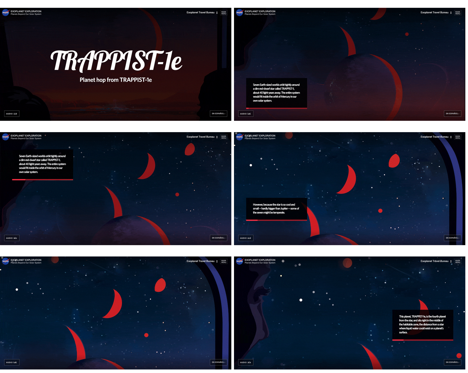
NASA has created an engaging webpage that allows users to journey through planets and technology. The interactive journey takes you through beautiful digital illustrations with accompanying audio and text to educate you on the subjects.
This is another great example of using colour, art and audio to create an engaging yet informative website.
Hopefully, some of these websites have shown you just how different website design can be. It’s all about finding what style matches your brand’s identity and how you can shape your business material to fit the website.
If your business needs any help with website design or development, don’t be afraid to reach out to us, Websense Development, as we can assist you in this area.

Sorry, the comment form is closed at this time.